Nothing to Watch
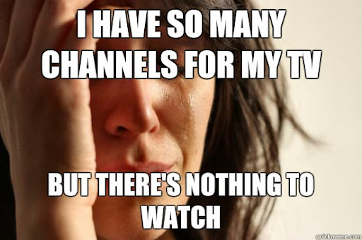
Oftentimes, people all over the world who watch television and stream media don't know what they want to watch and have a really hard time when searching for the right film or series. Because there are so many choices out there, the decision can be overwhelming very quickly for many people. To better understand this issue, we have designed and created a prototype for a mobile application called Nothing to Watch. This application will take in information about the user such as their age, gender, and watching preferences, and will then generate a list of five movies or television series available through cable or any of the various streaming services offered, customizable by the user within the settings of the application itself
Need Finding
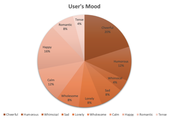
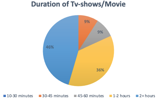
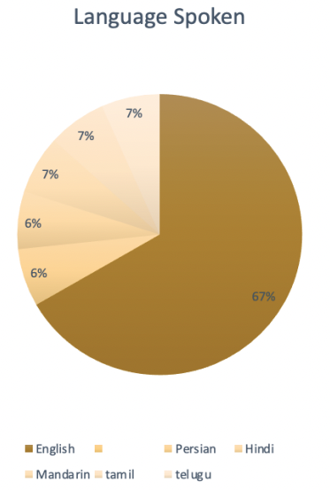
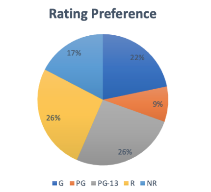
People who watch television and stream channels often have no idea what they want to watch. Since there are so many options, making a decision can be difficult. Our design must cater to keeping participants and users out of situations just like this. Our design should and needs to prioritize providing users with a list of movies and television shows based on their current mood, age, gender, and viewing habits or current preferences. The design also needs to allow for all of this to happen in a timely fashion in order to avoid stress and frustration.
Story Board
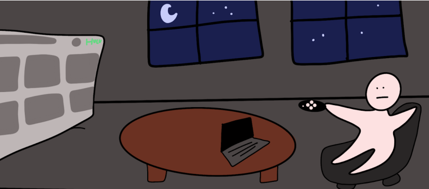
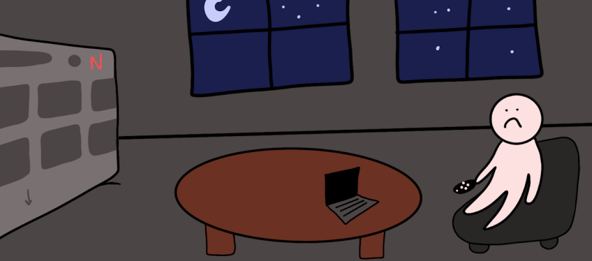
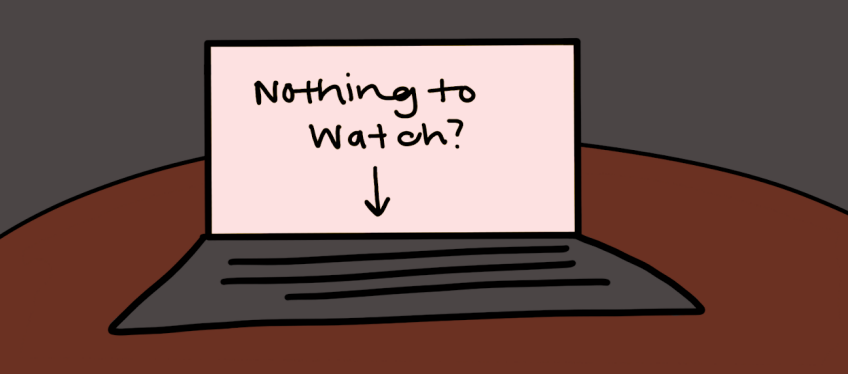
The storyboard, depicted below, shows a potential user who is looking for something to watch. In the first frame, they are looking through a streaming service and are not happy with their results. In the second frame, the potential user gives up scrolling through a second streaming service and is extremely unhappy as a result. In the third frame, the User opens up an app called “Nothing to Watch.” In the fourth and last frame, the user is happily beginning a movie. This storyboard clearly shows the quickness and efficiency of the fourth design goal.
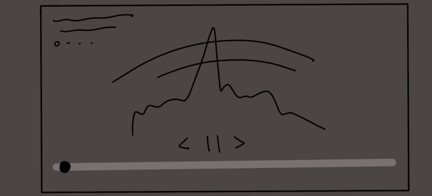
Low Fedility Prototyping
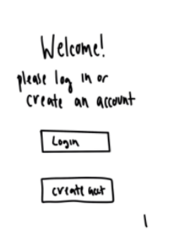
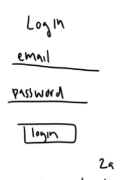
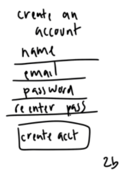
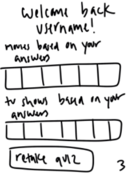
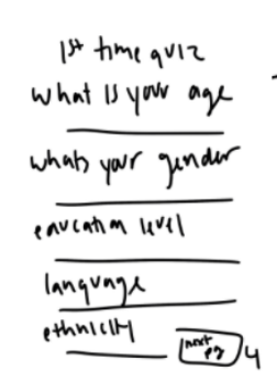
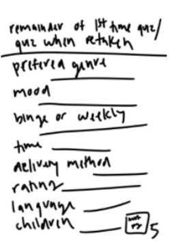
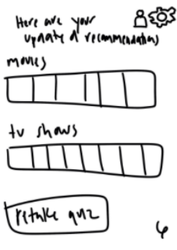
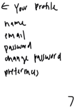
Design Prototype
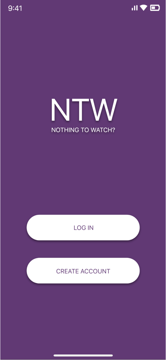
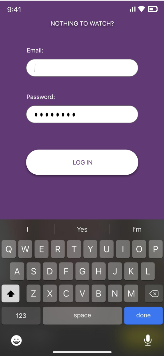
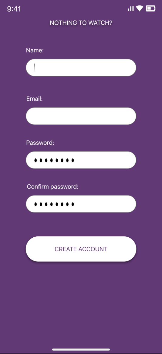
Landing Page
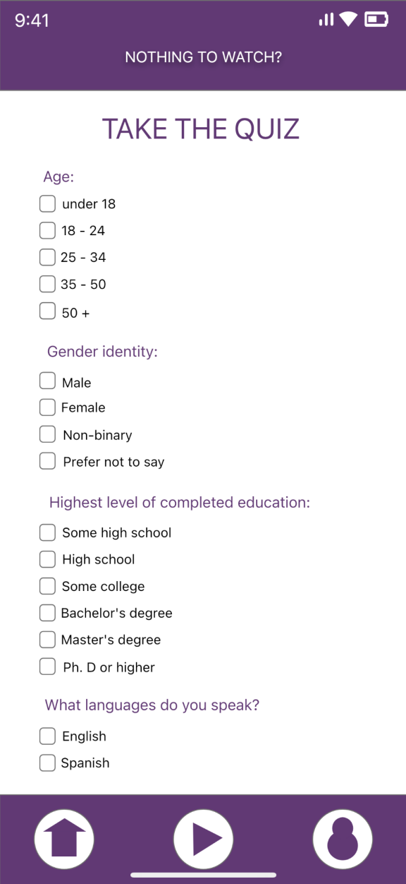
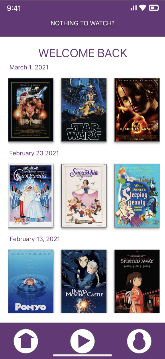
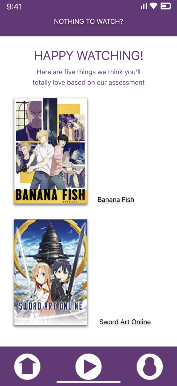
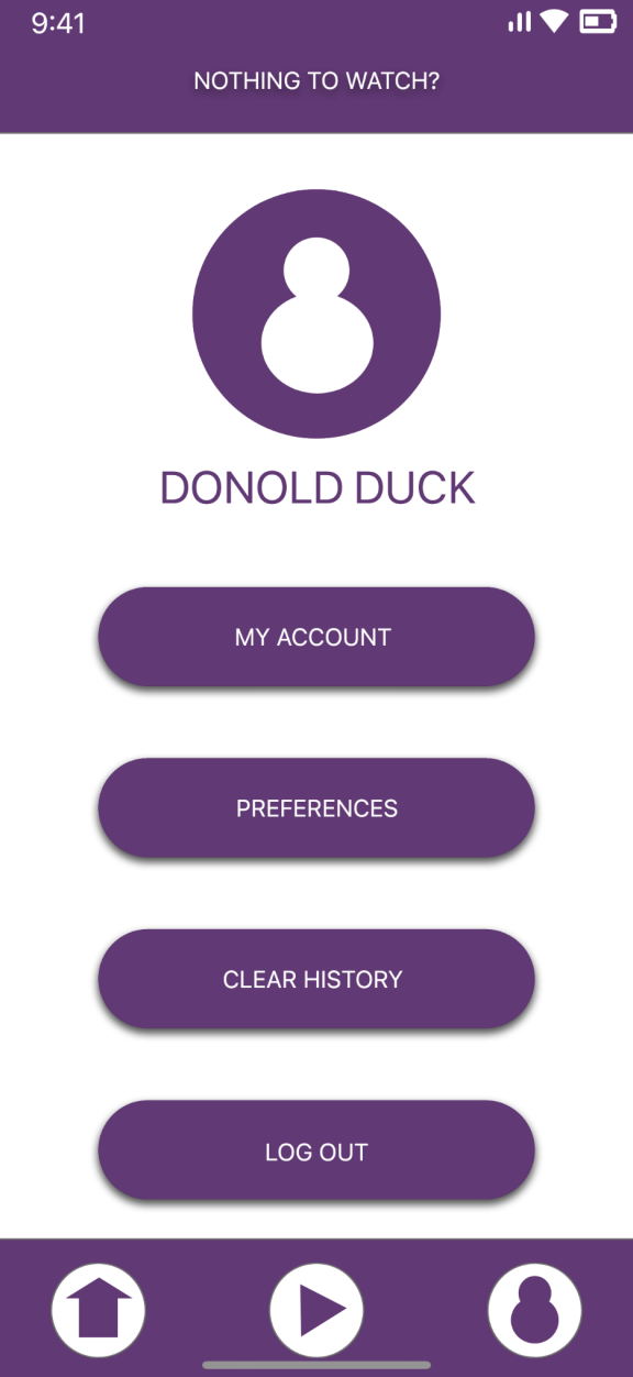
Usability Study
The purpose of this usability study is to determine the user friendliness and general user experience of the “Nothing to Watch” application. The users interactions, thoughts, and statements will allow us to assess the observability, recoverability, and robustness of the overall application. This is important, because if the user isn’t happy, the application will not be successful.
Measures and Goals
1. Observability: We would like to see how the user is able to relate to the
application as compared to other applications in terms of interface of the
application.
2. Recoverability: We would also like to see if the user is able to recover from the
error in selection of the movie or web series user is going to watch and also how
quick they can recover from that error.
3. Robustness: We would also like to see how easily the user is able to complete the
steps to watch the movie and also if the user likes the suggestions provided to
them when they don't have anything specific in their mind what they would like to
watch.
Summary and Conclusion
Overall we found that our prototype did a good job of meeting our design goals. We found that with our application users would spend less time searching for something to watch and could more easily make a decision after receiving their feedback from the quiz. Some other design goals were for users to be able to choose a movie or tv show based on their mood and select from a wide range of options and with our application they were able to do that with ease. One of our main design goals was for the users to be able to navigate through the application quickly and efficiently. Based on the user feedback some users struggled with navigating back to the assessment page after completing the assessment. After taking into consideration user feedback from the usability studies there are several ideas for the future of this project. The main change in the future that needs to be done immediately is to change the application so that the user intuitively knows how to navigate back to the assessment page. One potential feature that could be added is the ability to include a question in the quiz so that users can sort through their suggestions based on what tv provider or streaming service they have. For example, only being shown results that are currently available on Netflix.